Picking up where I left off on my last Cecropia post, here are a couple pictures of the caterpillars later in the 3rd instar phase.
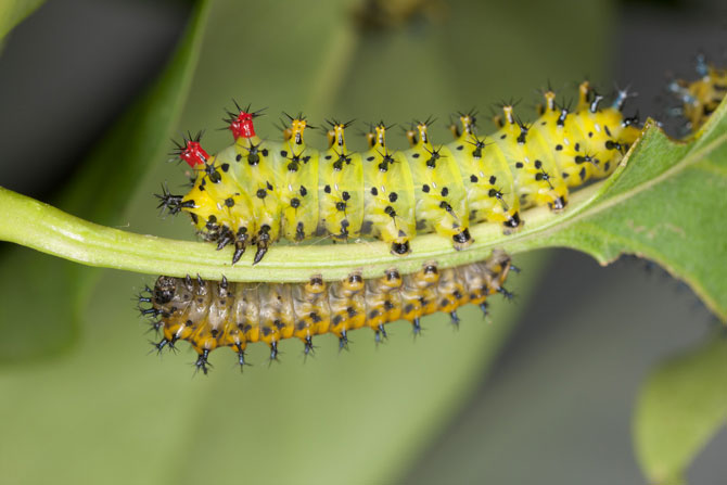
 This first one shows an early third instar above one in the second instar phase. They certainly do grow from one stage to the other, don't they?
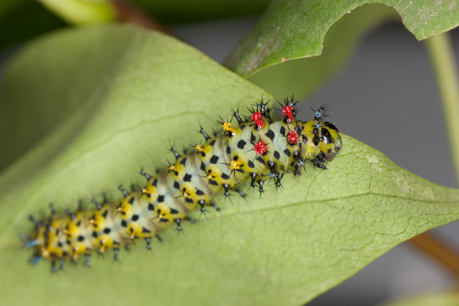
 This third instar is a little older. The body colors have muted some, and the blue pedicles are now showing -- at the tail end and in front of & beside the large red ones near the head.
0 Comments
We recently had an Amaryllis flower brightening up our home and I couldn’t wait to get out my closeup lens and play around with some different lighting and camera angles.
This picture is a good example of how closeups can look very abstract without our normal reference points in view. Yet, we often find this new perspective quite intriguing - it adds a sense of discovery as we figure out what we're looking at! The bright yellow anthers add a nice color contrast to the vibrant red of the petals, and the graceful curve of the stamen’s filaments and pistil echo the soft curve of the overlapping flower petals, adding a smooth sense of motion to the balanced elements of the flower. This image makes a nice decor print to brighten up any wall. I’ve also been enjoying it on my computer desktop lately, and thought it would make a nice image to share with you. Enjoy your free wallpaper image by clicking on the link below. When the window opens, control/click (PC: right click) on the picture and choose “Save image as…” I’ve also included links you can use to purchase fine art prints and cards, or a commercial use license. Click on the following links to: Download a free desktop wallpaper or purchase a fine art print or cards or download a copy for personal or commercially licensed use Enjoy! ...and let me know if you'd like to see more wallpaper! One of the hallmarks of macro, or closeup, photography is its extremely shallow depth of field. Traditional photography offered us a few ways to increase that, up to a point, but digital photography adds one fantastic tool that, for macro photographers, can’t be beat: Focus stacking! Imagine being able to take several pictures, each with the plane of focus moved further along the depth of the subject, then stacking them on top of each other and masking out all but the sharp areas on each layer. That, in a nutshell, is focus stacking! There’s a lot more to it, of course. Some programs, like Photoshop and Helicon Focus, help automate the process, but they don’t do all the work for you. Meticulous technique and prep work before taking the pictures will save you a lot of frustration and time at the retouching end. The real debate has been about how to take the pictures you’re going to stack! One faction says you have to move the camera to shift the plane of focus; the other says you have to keep the camera still and refocus the lens for each shot. Both seemed to have good reasoning for their view point. In the end, I decided to go with keeping my lens set on the magnification I needed for the shot and move the camera. I made a positioning base with a fine-screw thread to move the camera forward in the very small increments needed for macro work. Once I determine the aperture, and how large the final picture will be printed, I can calculate how far the camera has to be moved between shots. Overlapping the sharp field in each image by 25% helps keep the final picture sharp throughout, with no “fuzzy” bands through the image. After making my rig and doing some testing, I was beginning to have some doubts about my choice. The perspective seemed slightly distorted; the further parts of the subject seemed to be larger than they should’ve been. While I was testing my setup, Kerri Shannon, a friend and talented local jeweler, asked me to photograph some of her work. It was a perfect opportunity for a test! While shooting her new work, I chose one of her bracelets to shoot twice: one series with my positioning rig, then another by changing just the focus between each shot. Since I couldn’t change the focus as precisely as I could the camera position, I set up my camera for live-view shooting through my laptop and magnified the image on the monitor so I could overlap the depth of field between each shot. After processing both series, I imported them into Photoshop as two layers. I lowered the opacity of the top layer, to show any differences between the two trials, and moved it so the part of the bracelet closest to the camera was aligned on both layers. The difference between the two tests is most obvious on the far side of the bracelet, so I cropped just that section to show it here. Here you see a ghost image of the “focus-shift” stack over the “camera-shift” stack. The “focus-shift” image is the one with both left and right edges of the bracelet further to the left, closer to the red dot, which marks the optical axis, or center of the uncropped image. The “camera shift” stack has moved the far side of the bracelet further to the right, and the right edge of the bracelet has shifted further than the left edge, enlarging and distorting the true shape.
So, I hadn’t just imagined it! A little digging helped me understand what was going on; a couple simple experiments will help me explain. Our perspective depends on where we stand. Imagine yourself on a wooded path. If you keep looking directly in front of you and walk slowly along the path, the trees to your side will “move” in your field of view more than those directly in front of you. Our perspective of the world around us changes as we move in relation to it. It may help to try this from where you’re sitting. Look at an imaginary spot a couple inches to the left of your computer monitor. Notice where the left and right edges of your monitor are in your field of view. Now move your head directly towards that imaginary spot and notice what happens to the monitor. The left edge of the monitor “moved” a little to the right and the right edge of the monitor “moved” much further to the right in your field of view. The monitor got bigger, the right edge moving more than the left, as you moved closer to your imaginary spot. The same thing happened with the bracelet. As I moved the camera closer to the bracelet to put the far side into focus, it shifted in relation to the rest of the bracelet. The camera moved; the perspective changed. The focus shift method gives results closer to what our eyes see. We automatically focus along the length of an object to see all of it clearly. We judge the size and shape of an object by where we are in relation to it. That is our perspective. We judge the depth of an object by the relative size of its closer and further edges. If the further edge is made to look larger in relation to its closer edge (as it does by moving the camera closer to it), we’ll have a distorted view of its shape. After this test, I reshot Kerri’s images that I had focus stacked and was much happier with the results. You can see more of Kerri’s fine jewelry on her website. Have you played with focus stacking? Share your thoughts! |
Closer Viewsis my photo-invitation to slow down and soak in all the wonder and beauty woven through creation. Join for email updates!
Archives
August 2022
Categories
All
|